

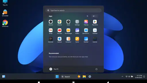
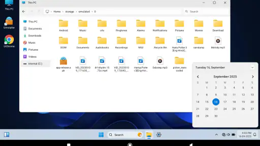
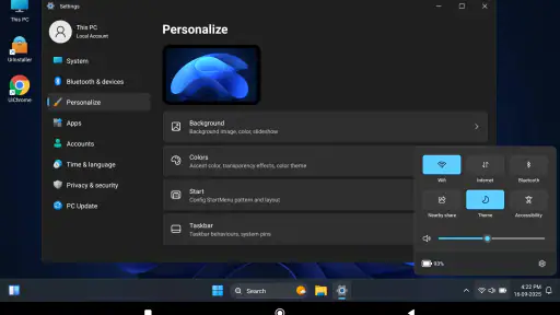
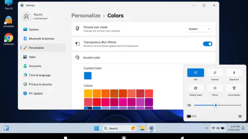
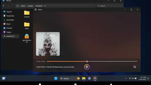
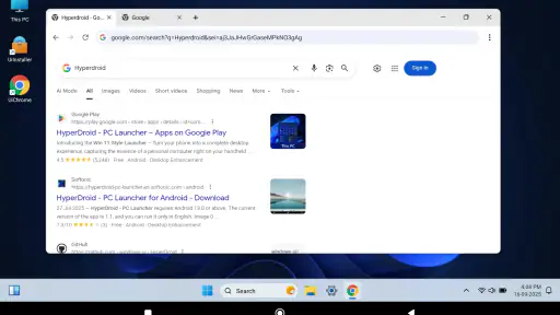
HyperDroid is a free personalization app from binary inc. that tries to make an Android phone feel closer to a desktop computer. I approached it with a simple question: does the PC-style idea make everyday phone use clearer and more practical, or does it merely add decoration? After spending time with it, my answer is that it can be a useful change of working style, especially for people who prefer a more structured screen, but it is not automatically better than the standard Android interface.
The app’s short description is simply “HyperDroid,” while its broader store summary points toward a desktop experience. That description is brief, so the real value is in how the launcher changes the way I look for and open things. It belongs to the personalization category, is rated for Everyone, and is available at no cost. Its current version is 2.7, and it works on Android 6.0 or later, which makes it accessible to many older devices as well as newer phones.
How the desktop layout affects readability and navigation
The strongest idea here is not a new collection of wallpapers or icons. It is the attempt to give Android a more computer-like mental model. Instead of treating the phone only as a series of app pages, HyperDroid presents the device as a workspace. For me, that changes the first few seconds of interaction: I start thinking about where an app belongs and how I want to reach it, rather than simply swiping until I see a familiar icon.
That distinction matters to people who find conventional home screens visually busy. A typical Android setup can become crowded with several pages, folders, widgets and notification dots. A desktop-inspired launcher can make the screen feel more intentional because the layout suggests a place for tools, shortcuts and frequently used items. I found that especially helpful when I wanted to move between communication, notes and browsing without losing track of the starting point.
Readability is not only about large text. It also involves predictable grouping, contrast, spacing and the amount of information competing for attention. HyperDroid’s PC-oriented presentation can support users who understand information better when it is arranged like a workspace rather than a vertical app drawer. Someone who regularly uses a laptop and feels comfortable with desktop conventions may learn the layout quickly.
At the same time, a desktop metaphor is not automatically clearer for everyone. If you have always used Android’s default launcher, the change may initially create extra decisions. You may need to remember whether an item is represented as a shortcut, an app entry or part of the launcher’s broader workspace. That learning period is a real trade-off: the interface can feel more organized after adjustment, but the first impression may be less immediate than the familiar phone layout.
I would recommend setting up only the apps I use repeatedly instead of trying to reproduce every app on the phone. A compact workspace is easier to scan than a complete catalogue. I would also keep categories practical rather than clever: messaging, travel, work and media are easier to recognize than labels based on personal jokes or temporary projects. This is one of the more useful ways to approach the app because the desktop style works best when it reduces searching rather than becoming another project to maintain.
For users with reading difficulties, the main question is whether the chosen arrangement lowers visual clutter. HyperDroid can help when a clear workspace is easier to understand than multiple pages of icons, but it cannot replace Android’s own display and text settings. I would adjust system font size, display size and contrast first, then evaluate the launcher. A launcher should complement those settings, not be expected to solve every readability problem on its own.
A practical routine for work and study
One realistic scenario is a student who uses a phone beside a laptop during a study session. With the standard launcher, the phone may be a collection of social apps, games, media tools and school resources mixed together. A desktop-style arrangement can make the device feel more like a secondary workstation. I would place the browser, document tools, calculator and communication apps where they are easy to reach, while leaving less relevant distractions outside the main visual area.
The same approach suits someone who uses a phone for remote work. A launcher cannot turn a small screen into a full computer, but it can make the phone’s role more understandable. If I need to check a message, open a file or look up a detail, a workspace-oriented layout may reduce the feeling that I am navigating a toy-like grid. That psychological shift is subtle, yet it can make short tasks feel more deliberate.
There is also a useful benefit for people who move between Android and a desktop computer during the day. The visual language may feel more familiar than a purely mobile arrangement. However, I would not choose HyperDroid only because I want a perfect Windows or Linux replacement. A phone still has touch-first limitations, and expecting full desktop behavior could lead to disappointment.
Touch, vision, sound and different situations
From a motor perspective, a desktop-style launcher can be helpful when I prefer deliberate taps over fast swipes. A workspace with recognizable destinations may reduce the need to perform repeated gestures across several home-screen pages. That can matter for users who find precise swiping tiring or inconsistent. It may also be useful when holding the phone with one hand and wanting a stable starting point.
There is an important exception. Desktop-inspired layouts sometimes place more controls or smaller targets into the same area because they are borrowing ideas from a larger display. On a phone, that can make accuracy more important. If you have limited dexterity, tremor or difficulty with small touch targets, the best arrangement is the one that leaves generous space around the shortcuts you use most. I would avoid filling every available area, even if the interface makes that tempting.
For people with low vision, the useful test is not whether the design looks like a computer. The useful test is whether the next action is easy to identify. I would judge HyperDroid by the clarity of its labels and the amount of visual competition on the screen, then combine it with Android’s magnification, font and display options where needed. The launcher may provide a calmer structure, but system-level accessibility tools remain important for more demanding visual needs.
Users with sensory sensitivities may appreciate a workspace that feels less chaotic than a constantly changing home screen. Reducing unnecessary icons and keeping a consistent arrangement can make the phone easier to approach. On the other hand, any interface that introduces more visual elements than the default launcher may feel overwhelming. My advice is to start with a restrained layout, use only familiar shortcuts and remove anything that does not support a real task.
People who rely on screen readers should evaluate the launcher through actual navigation rather than appearance alone. A clean visual design does not guarantee that every element will be announced in the most useful order. I would test opening the main workspace, moving through app entries and returning to the previous screen with the preferred Android screen reader enabled. If those steps feel slower or confusing, the default launcher may be the more dependable choice.
Sound is another situational consideration. In a quiet room, I can focus on a new layout and learn its logic. In a busy street, on public transport or while carrying something, I need the shortest possible path to an app. HyperDroid is more appealing when I have time to use the workspace intentionally. For urgent, one-handed access, a familiar default setup or a carefully chosen shortcut may be faster.
Where it fits into daily routines
I can see the app working well for an older phone that has accumulated years of unrelated apps. Instead of replacing the device, I would use a desktop-style home environment to create a small set of clear destinations for calls, messages, maps and essential services. That does not guarantee better performance, but it can make the device feel less confusing. The benefit comes from organization, not from pretending that the hardware has changed.
It can also suit a family member who understands computers better than smartphones. Explaining a phone through a familiar desktop concept may make the first conversation easier: this is the main workspace, these are the tools, and this is where the rest of the apps can be found. Still, I would introduce it gradually. If the person already knows the standard Android home screen, switching without a short orientation could create more support calls rather than fewer.
For children, the Everyone rating makes the app broadly suitable from a content perspective, but that does not make it a complete family-management solution. I would not treat the launcher as a substitute for device supervision, app controls or conversations about safe use. Its role is visual organization, and that is where I would keep expectations.
For people who use their phone as a quick camera, music player or navigation tool, the desktop approach may be unnecessary. These users often benefit more from immediate access than from a computer-like workspace. HyperDroid is better matched to someone who wants the phone to feel like a personal information desk, not someone who wants every action reduced to one tap.
Remaining barriers and the compromises to understand
The largest barrier is the gap between the metaphor and the hardware. A desktop layout can make Android feel more familiar, but it does not provide a physical keyboard, a mouse or a large monitor. If your goal is serious document editing, window-heavy multitasking or precise pointer control, a launcher cannot deliver the same experience as a real computer. In that situation, the usual Android launcher may actually be more honest and efficient.
There is also the cost of transition. Every launcher change adds a small layer of uncertainty: where is the app I normally open, how do I return home, and what happens when I need a system setting? Even when the design is understandable, the first day can be slower. I would install it when I have time to explore, not immediately before travel, work or an important appointment.
Another limitation is that personalization can become maintenance. A carefully arranged workspace is useful until new apps, changing priorities or temporary tasks make it outdated. If I keep adding shortcuts without removing old ones, the same clutter returns in a different shape. The solution is a short monthly cleanup: keep the main area for frequent actions, move occasional tools elsewhere and remove duplicates.
People who depend on manufacturer-specific launcher features should also think carefully before changing their home environment. The default Android or phone-maker launcher may integrate more naturally with the device’s established habits. If you rely heavily on its widgets, gestures or visual conventions, the switch may involve more compromise than benefit. HyperDroid makes the most sense when the desktop approach itself is the priority.
Performance expectations should remain realistic as well. A launcher changes the interface people use to reach apps; it does not turn an older phone into a faster model. If the device is slow because of limited memory, storage pressure or demanding apps, a new home screen may improve the feeling of order without solving the underlying problem. I would judge it by navigation and comfort, not by expecting a hardware upgrade.
Privacy-conscious users may reasonably want to review any launcher’s behavior and permissions before making it their daily home screen. I would do that during setup and check whether the app fits my comfort level. This is not a criticism unique to HyperDroid; it is a sensible step whenever an app becomes part of the phone’s basic navigation. If that review creates concern, staying with the built-in launcher is the simpler option.
Who should choose it, and who should skip it
I would recommend HyperDroid to people who like desktop organization, feel lost among ordinary Android home pages or want an older phone to seem more structured. It is particularly interesting for users who switch between a computer and a phone and prefer a consistent workspace idea. The free price removes the need to make a financial commitment, so trying it is relatively straightforward.
I would be more cautious for users who need the fastest possible one-handed actions, depend on screen-reader navigation, dislike interface changes or already have a highly efficient default setup. In those cases, the novelty of a PC-style launcher may not compensate for the extra learning. The right choice is not the interface that looks more impressive; it is the one that lets you complete common tasks with the fewest mistakes.
The app has attracted a substantial audience, with more than a million installs and an average rating of 4.5 from roughly twenty-two thousand ratings. Those figures suggest that the concept connects with many Android users, but they do not predict whether its layout will suit your eyesight, motor preferences or daily routine. I would treat them as a reason to explore it, not as proof that it will replace your current launcher.
Because binary inc. released it on June 23, 2024, and the current version is 2.7, I would also keep the practical evaluation focused on the experience available now rather than on the promise of future changes. The important question is whether the present workspace helps you find what you need. If it does, the app can become a comfortable alternative to the standard Android home screen.
My inclusive verdict
My overall impression is positive but specific: HyperDroid is most valuable as an organizational layer. It gives Android a desktop-flavored identity that can make navigation feel more purposeful, especially for people who understand computers more easily than conventional mobile layouts. Its accessibility value is situational rather than universal. A calmer workspace may help some users, while smaller or less familiar controls may create friction for others.
I would install it, build a deliberately small main workspace and test it during the parts of the day that matter most: opening communication tools, finding essential information, returning home and using the phone one-handed. I would also test it with any display or screen-reader settings I rely on. If those basic routines become clearer, the launcher is doing useful work. If they become slower, there is no shame in returning to the default option.
The best reason to use HyperDroid is not that it makes a phone look like a computer; it is that its workspace idea may make your own habits easier to understand. That makes it a worthwhile free experiment for organized users, computer-oriented newcomers and anyone tired of a crowded home screen. It is not the right answer for every ability or every situation, but with a restrained setup and realistic expectations, it can make Android feel more approachable.


